The search for link colors that are equally readable both black and white website backgrounds
One trick I’ve been using a bunch is a one rule CSS dark theme for simple projects.
html {
  color-scheme:light dark;
  background-color:canvas;
  color:canvastext;
}
This uses the built in browser system colors. When a user has a preference for a dark theme set at the browser level, then canvas is very close to black, otherwise it is white. canvastext is similar. You can see what they look like on your browser here: https://developer.mozilla.org/en-US/docs/Web/CSS/system-color.
Why?
Bytes matter… and once in a while, more then design considerations. This adds very little overhead in a CSS file while respecting and user dark theme preferences. So if you are building a quick personal side project, it’s good. If you are building a website meant for low powered devices with abysmal data connections… it’s a fine tool to have. If you are lazy and only want to write down one CSS rule and be done… perfect 😆
But… it’s ugly?
Yeah, on its own it can be a bit ugly. I’m not a fan of the default link colors (i.e. the default system colors for links) on the browsers I use. So I set out on a quest to find some colors to use instead. Ideally a blueish color for unvisited links and a purplish color for visited ones. I also wanted to keep in mind accessibility considerations. Some color combinations are hard on the eyes and render a website unusable in other cases.
So, high contrast is the name of the game. One tool I use is the webaim contrast checker. But there are a lot of colors and I’m not doing that check manually. JavaScript and Stack Overflow to the rescue! I’m looking for colors that rank equally well on black and white with the highest contrast score possible.
Results
After some trial and error I discovered that you can’t get a contrast score of above 4.58 for a color on both black and white backgrounds. Which only meets AA standards for normal sized text. But they do meet AAA standards for large text. Here were the top 9 results I found:
| RGB color | White contrast value | Black contrast value |
|---|---|---|
| rgb(3, 137, 1) | 4.582577201968528 | 4.5825741879436475 |
| rgb(194, 83, 53) | 4.582573694982736 | 4.5825776949298165 |
| rgb(226, 14, 123) | 4.582573911685348 | 4.5825774782270265 |
| rgb(207, 57, 134) | 4.582574731368912 | 4.58257665854297 |
| rgb(169, 89, 154) | 4.582577946061603 | 4.582573443851183 |
| rgb(118, 108, 181) | 4.58257700240974 | 4.582574387502314 |
| rgb(214, 11, 182) | 4.5825744373751665 | 4.582576952536859 |
| rgb(207, 13, 204) | 4.582575574969581 | 4.5825758149421025 |
| rgb(101, 98, 242) | 4.582577110830905 | 4.5825742790812125 |
Another consideration is color blindness. Here are the colors using a color blindness tool
So for me, some of the obvious color combinations would have been awful for someone with color blindness. This is the full list:
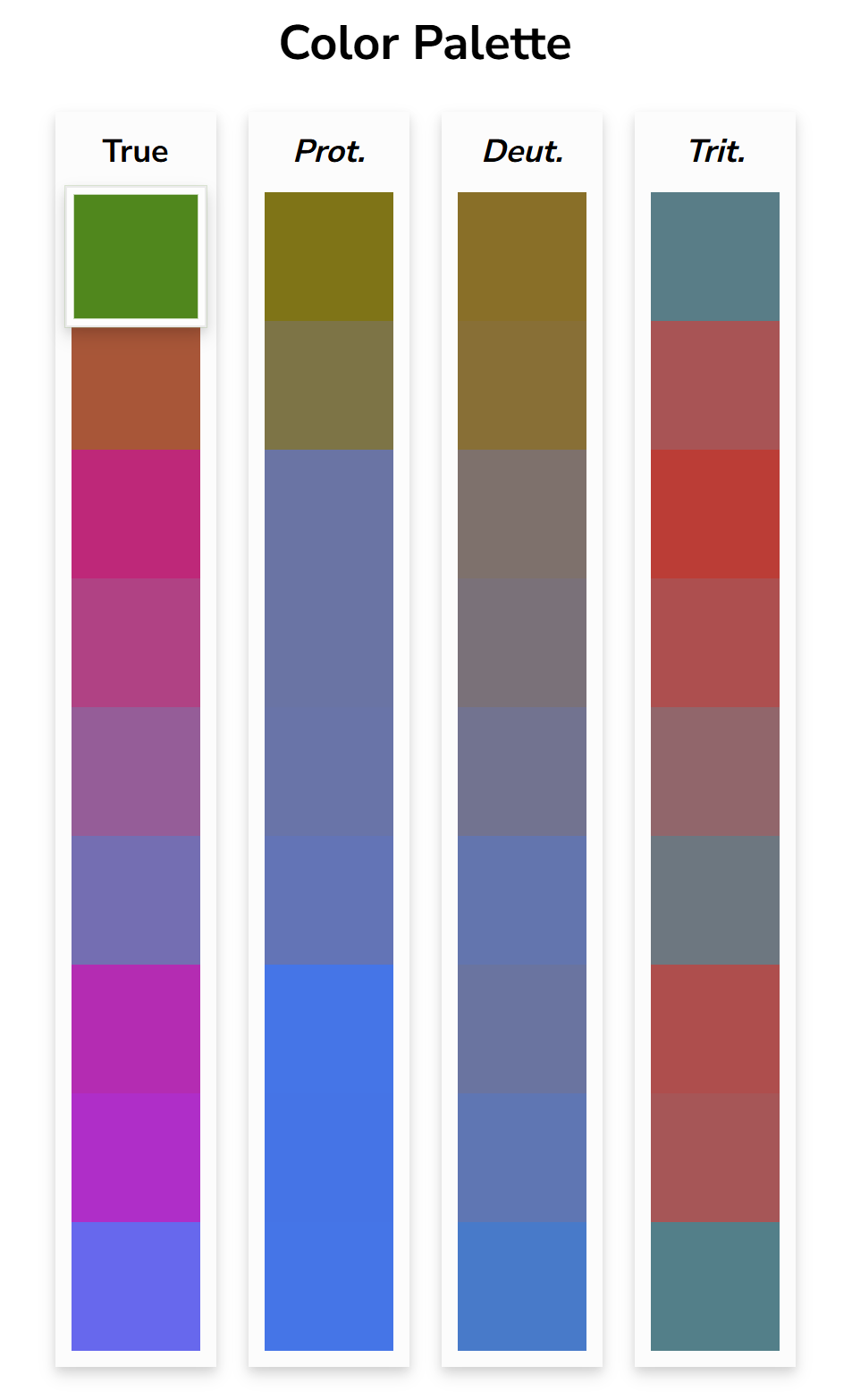
And here is what I would have picked without checking first:
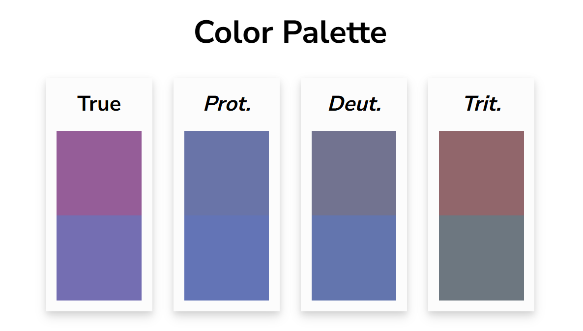
Which for those with protanopia or deuteranopia those colors would be hard to distinguish. So in the end I decided my quick side projects would use these colors:
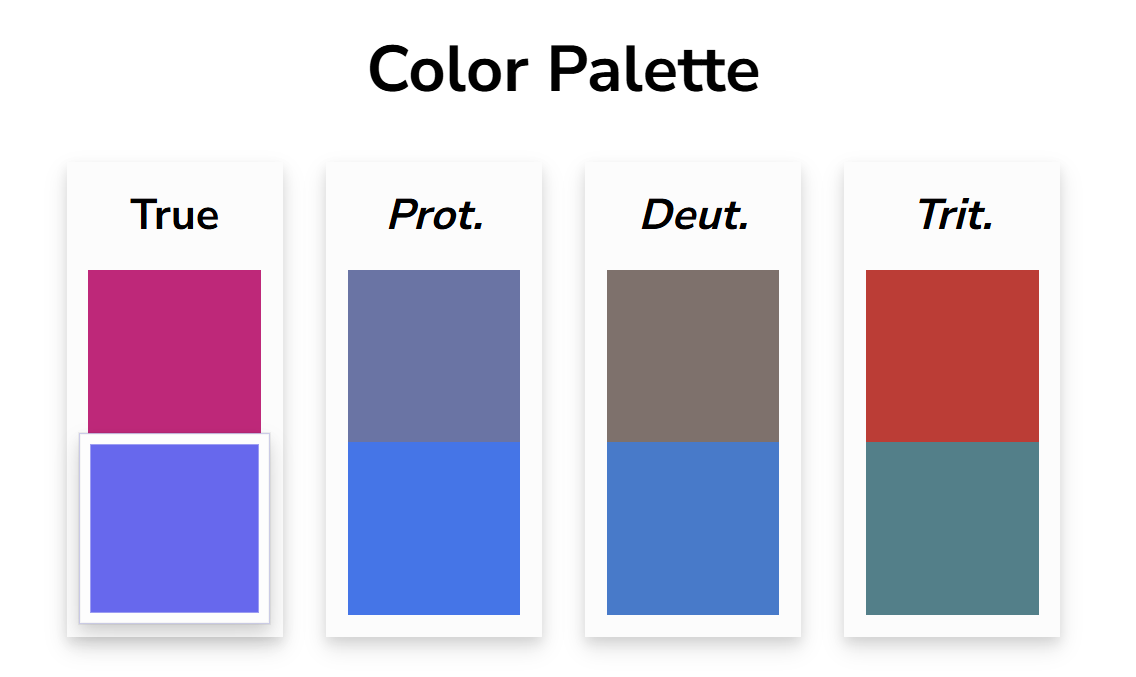
Which look visually different across the three common color blindness types.
That makes my new side project default css the following:
html {
  color-scheme:light dark;
  background-color:canvas;
  color:canvastext;
}
a { color: #6562F2}
a:visited { color: #E20E7B}
Since Color was a prompt for the 2024 Weird Web October challenge and I’m still trying to catch up on that challenge a year later I added it to my collection. Besides list the colors above, it lists 9 additional colors that the contrast on black and white are as far apart as they can be while still retaining a minimum contrast ratio of 3.
Interactive Example
Here is an interactive example that calculates the contrast values on two different background colors. The “JS” tab holds the logic and the “Results” shows the results. Try selecting some different colors on the results tab. A contrast rating above 3.0 is considered AA on large text. If you want to see the calculation I did for the table earlier in the post you can check it out here. I didn’t include it because it iterates over every color combination and it can be a bit slow to load the results tab.
Conclusion
I’m not sure how practical this is for anything other than a quick side project. It doesn’t take to many extra bytes to add in some media queries in CSS to pick separate colors with better contrast for dark and light backgrounds. But I always like to see how simple you can push things so I’m happy to have found some sort of answer.
Dispatches from the fleet
What passing ships signaled back
Unfurl the messages